Sufferborn’s New Look!

Finally, it’s here! I am proud to present the brand new cover for Sufferborn (book 1)! It was a long journey, short if you consider the time frame, but a fairly smooth transition. The worst part about it has been my anxiety: what should the new cover look like? Which idea to go with? How long will it take to paint? How long will it take for the final oil glaze to dry? How long will it take to get it professionally scanned? And can I get a ride to the photoimaging company downtown Nashville?

The thing is, I needed to get it all completed before February in order to use the new cover for an ad I had already bought. Though all of those concerns ran smoothly, it was the waiting that hurt the most. When you have a big project (and OMG, yes, making a good, hand-painted book cover is a HUGE project), you just want it to be over and done right now—hahaha, know what I mean? But patience and diligence pays off. Even if it takes a long time, practicing patience and diligence will get you the narrower time frame—procrastination will draw it out for additional months and even years.

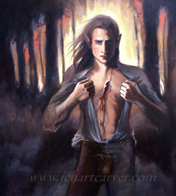
So the painting. In my haste to create and get it done, I have been completely uninspired about what to name it. Though I usually love naming paintings, this one I couldn’t quite take the time to care about what it was called—lmao! I slapped the title “Sufferborn Trio” onto the back for the benefit of identification when dropping it off at the photoimaging company and called it a day. Dusted my hands off.

Sufferborn Trio is a great one, I think. In my opinion, it’s a fine replacement for the original cover, titled “Open Heart.” Sufferborn Trio is no less complex and expertly done. I did my best to be as expressive as possible, keeping loose, while at the same time digging in hard to create the BEST possible piece I could within my personal skill boundaries.

Take notice of the two characters at the sides, Daghahen and Lamrhath, the insidious twins who will become quite the epic pillars of drama as time passes. Looking at my references, I knew that the two characters on the sides had to be foggy and recede so that the central figure, Dorhen, can clearly stand out. I had two steps for making that possible: step 1 was to paint them thinly and “coldly,” and step 2 was to go over their whole figures, after they dried, with a whitish glaze. A glaze is when you add a tiny speck of paint to a large glob of pigment-free linseed oil. Because I need my book cover paintings to dry fast, I used liquin original instead of oil for this. I especially used a lot of thin, expressive strokes for Daghahen (at left) to create his elderly appearance. A lot of his blue underpainting shows through. Lamrhath (at right) was painted similarly, but with more careful, thoughtful strokes and coverage. His colored layers are still thin, allowing the underpainting to show through, but all of him is still extremely thin and even, dare I say, underdeveloped. That’s how they both turned out looking faint and cold. It also kept my painting time short and simple, a win-win.

Dorhen, on the other hand, got all my love—as he always does. His face contains the thickest layers of paint on the whole piece, followed by the rest of his exposed skin. Any piece of clothing that appears dark, I take the liberty to keep thin and easily executed, which is something that I’ve picked up in the last decade of painting.

But I won’t bore you anymore with painting techniques. In effort to make this new cover communicate the book’s genre more clearly (dark/epic fantasy), I chose these three characters. These three are present in the prologue of Sufferborn. The twins are the root of the problems that concern the main characters, Dorhen and Kalea. And this scene depicts a moment at the middle of the book when all the elements come together to create the “real” dilemma in the Sufferborn series. This should be a fitting cover indeed.

There you have it! A brand new book cover. Hope you enjoy the book and its new look! If you are a person who misses the old cover, subscribe to this blog on the sidebar for news on when I have posters available. If you would like to get your hands on a copy with the old cover, click the “contact” tab at the top of this site to ask me directly for one. I have a few kicking around and might be able to hook you up (and I’m happy to add autographs)!

Check out Sufferborn on Amazon!

Sufferborn will get a new cover for book 1

That’s right, folks, a new cover for Sufferborn is in the works and will be released soon! You may or may not find this news favorable and I understand either way. So for now, I’ll fill you in on my reasoning and let’s take a moment to appreciate the old book cover.

Why am I changing Sufferborn‘s book cover? The answer is simple: advertising. That’s all. I do love the painting on this cover and will cherish it forever, but in order for me to have more flexibility for advertisement, I’ve decided to design something a little less edgy. Lately, my attempt to buy an ad was rejected for reasons of “blood and gore”—hahah, I’ll take it as a compliment! So that’s the practical reason for doing so. Let’s go back in time a few months though. Although it IS a good painting and I love it a lot, I can’t deny that I’ve felt a slight…hesitance(?) about how the cover was looking. It was one of those things that you love at first, but then your mind starts wandering into foggy territories of doubt. My doubt was so, so slight, it’s hard to explain. I did not voice my doubt for a long time, but it was there. After a lot of wonder and debate and finally asking my husband and friends if they thought a book cover change would be good (my husband was against it), I decided to just leave the cover as is and move on with my plans for book 3… And then the advertising problem happened. It was the answer to my dilemma.

What made the old cover so special? My friends, it was special. Let me tell you. I don’t know if it was the ideal cover for book 1, but I really put my heart into it. Let’s take a look at “Open Heart,” Sufferborn‘s soon-to-be-former cover…

Open Heart. Oil on linen. 2019.

What to say first?… “Open Heart” was designed to express the character that is Dorhen. His soul. I thought, “If I can paint his soul, I will.” The wound is symbolic. In the book, he tells Kalea, “I lost my soul.” And in another scene, Kalea tells him he has an empty heart, or maybe a hole in his heart. The hole in his chest means a lot to this book. It’s everything in the book. The look on his face was aiming to show Dorhen’s desperation in the book. He’s looking at Kalea and showing her his wound. He needs her help and he’s pleading to her. The fire in the forest behind him is his past, a literal representation of something in the story. Even his codpiece is made apparent on the cover—something of his garments that is brought to attention. This, I would say, is a perfect image of Dorhen. Dorhen is a character I’ve had trouble painting and drawing for many years. Not that it’s hard to come up with a brown-haired boy with sad eyes, but maybe its all the emotional signals I had been missing in previous attempts.

How did I construct this character in paint? Dorhen in this painting is made up of a radical number of different references. Even I was shocked at how many things were blended to create this person! Once again, I was also shocked that I had finally created such a perfect image of the elusive Dorhen. Who would’ve thought that all I needed was a photo of my husband, one of my favorite bought art model photos (who looks nothing like Dorhen), and a few stock photos of manly chests? The most recognizable trait of my husband’s is the hands and forearms. I snapped a photo of him doing this pose and it proved all I needed for the arms. As a result of using his meaty Scottish arms, Dorhen turned out looking strong—like someone who can take a lickin’ and survive in the forest. The “strong” trait was exactly what I was looking for too, because I don’t think of the “Norr elves” as being lithe and delicate. The Norr elves are rugged and tough. Male elves (a.k.a. saehgahn) like to fight within their own communities, and building a strong appearance for female elves to ogle is very important to them. Dorhen’s face was a thing of trial and error and it required many layers and a little frustration and repainting to achieve. Each step, whether it was on purpose, unplanned, a mistake, a repaint, or a well-planned system of layers, played a part in achieving this face. When I put down that final “draft” of the face, it was a magical moment.

The fire in the background was by sheer accident, regardless of what I said about it being a direct communication of the book’s content. I was going for a sunset effect behind the trees (to symbolize that his time is running out). Instead, it looked like the forest was on fire, and I went with it. It had to have happened subconsciously though, because I was quite emotional around the time of painting. Lots of emotion was flowing as I worked, and I think it shows quite clearly.

In conclusion, “Open Heart” was emotional, tragic, fiery, sad, desperate, and a little romantic (gotta love that codpiece!). It seemed like the perfect cover for Sufferborn at the time. But now I’m moving on and trying something else. Fans of this painting, do not be sad. It may be disappearing from the book cover, but that doesn’t mean it’s actually going anywhere. I still have the painting and always will. And I’ll see about putting it on a poster for sale soon. Look at it this way: printed copies of this book cover will soon be rare collectors’ items!

When does the new cover come out? I’m aiming for early February (2021). I spent the Christmas season painting and right now the final cover is deep in the works. I will share a cover reveal teaser soon, followed by an official unveiling. The new cover is also one I find very relevant to the story.

Check out Sufferborn on Amazon!